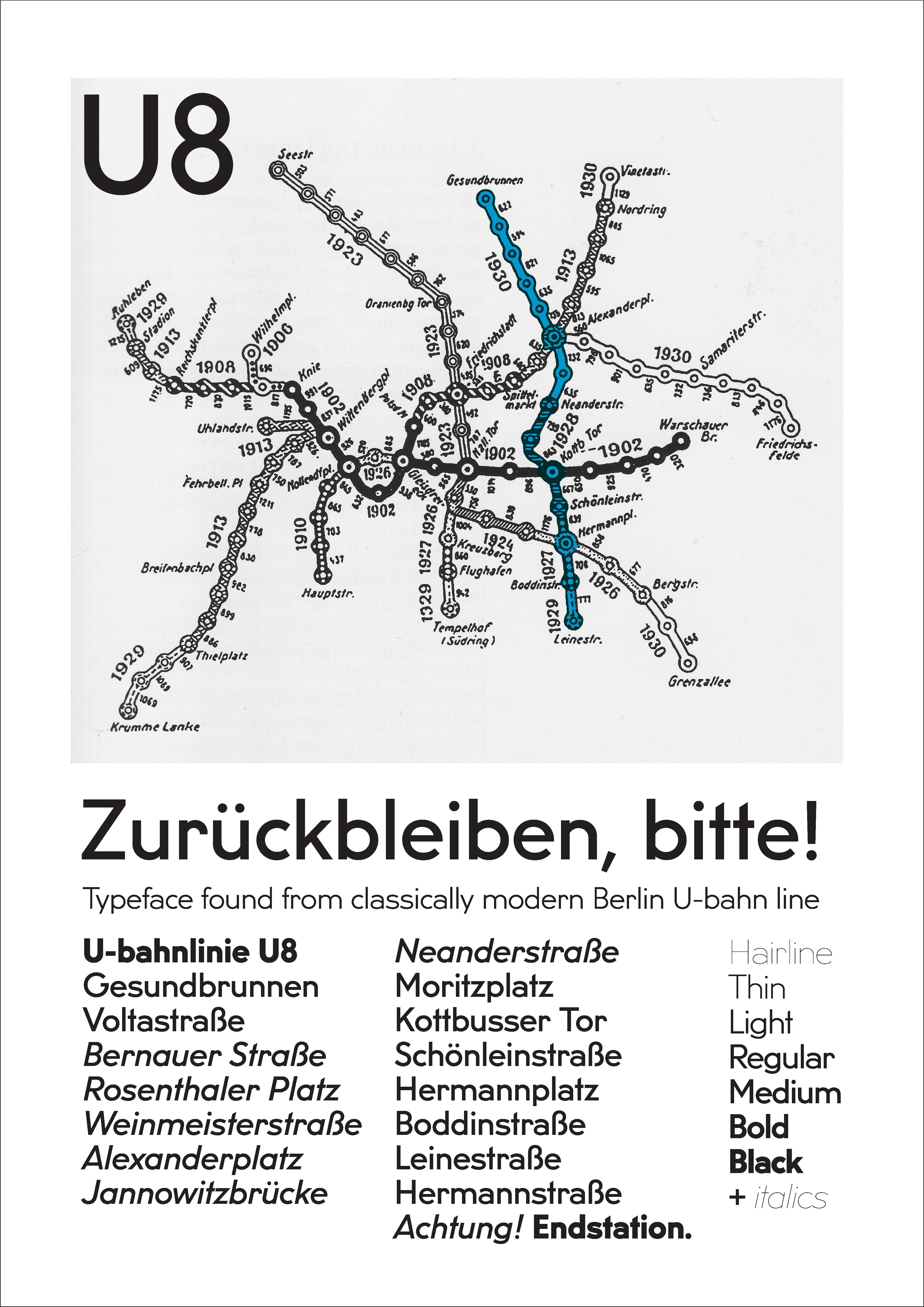
About
His goals were to restore a piece of history, research a link between the DIN and Bauhaus, and translate the lettering of individual handcrafted station signage into a formal typeface. Apart from the medium weight’s upper and lower case, glyphs such as numbers, and other weights, had to be created by the designer, allowing for his contemporary interpretation. The result is an early modernist typeface, with wider proportions than most common geometric sans, a strong character, and a clean design. Initially intended for display purposes, U8 has proven to work well in text sizes.
The typeface comes with a full character set for western and eastern european languages, and a number of OpenType features such as ligatures, smaller figures for text, tabular figures and fractions.
Introduction
A few months ago I was participating in the exhibition “Hier wäre das Leben leicht”1, held at Art laboratorium, Berlin. While working with the wide subject of typography, I was visualizing through text some feelings about Berlin. With different tryouts and tests I just slowly confirmed to myself that what really attracts me about big cities is the rapid transit, (more precisely U-bahn). In a way we are dependant on such means of transportation in cities with great population. Getting through the town by car you will be more likely stuck in traffic jams (Staus) and by tram you can drive only in few areas (if a city has any trams. Berlin has only in its North-Eastern part). With buses one can feel at ease only after being accustomed to the city’s transportation system.
The project at Art Laboratorium urged me to look once more into the collection of photos from U-bahn that I have been collecting for several years. This seemed intriguing, soon I found myself sketching the typeface while sitting in the library. The following text is based upon loose fragments that I have found about trains, tunnels, concrete and station signage.
1 Hier wäre das Leben leicht -There, Life Would Be Easy, 29.18.2008 – 04.01.2009, Berlin
About lines
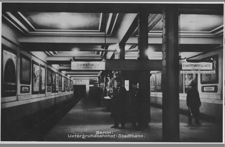
From the first visit to Berlin my eye caught some differences between other subways of the cities that I have seen before (St. Petersburg, Moscow, Paris, London, Stockholm, Helsinki, Barcelona, Tbilisi). Berlin subway seems more bigger than the one in London/Paris and it is more down to earth compared to the one in Moscow/St. Petersburg. Things that make the impression of greater space are the entrance portals to the station, the interiors of trains and size of tunnels.

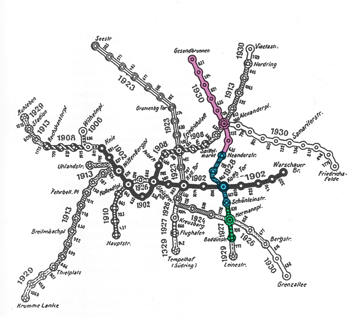
There is a striking difference between the U-Bahn lines in Berlin. Some look like designs originating from the office of Emperor Wilhelm II. In those stations, we see antique-ish columns, stucco decorations on the walls, cassette ceilings, and trains on these lines are often smaller (kleinprofil).
My favorite line looks like its made by brave modernists who founded Bauhaus. Steel profile columns (mostly the supports are steel ‘H’ rails fixed together with rivets), monochrome walls covered with building ceramic, these are the elements that fit with simple geometric typeface. Trains of this line offer a possibility to ride inside of an early modernism that has been functioning all the way to the present day. All different designs of the stations were made mostly by the same architect Alfred Grenander together with team of engineers. Grenander was the leading mind behind the foundation of U-Bahn.
U8 line was line D
Construction of the line was started around the time of World War I, the whole project was conceived in three distinguished phases. First was the South part (1927 Boddinstraße – Schönleinstraße), then the building extended to North until Kottbusser Tor, after that followed the North part (Neanderstraße – Gesundbrunnen).
The construction technique was mostly cut and cover2, except tunneling under River Spree.
Plans for the project were made by S&H3 team much earlier, but apparently break in the preparation allowed to make several amendments to drafts and enhanced the project – initially, the line was meant to be straighter and it had to cross with the subway line Moabit–Treptow. The tunnels for Moabit–Treptow were partly excavated and they still lie under the city. As a sign of that we can observe the unproportionally large station Moritzplatz.
2 Cut and cover- technique for constructing subway tunnel by first digging trench, securing the side walls with concrete and after that constructing the ceiling and covering it with roads, etc
3 S&H – Siemens & Halske
Working on shapes
U8 is a type revival project. The task was to restore a part of history; to find a link between DIN4 & Bauhaus; to translate display type into the text typeface.
4 DIN–Deutsche Industrie Normen. Organization for Standardization.
In digitizations I gave my best to preserve as many quirks and inconsistencies as possible. This task was hard, because in U-Bahn stations every sign is made like a separate piece of art. During the process, while I was transferring U8 atmosphere into typeface, warnings given by older colleagues got confirmed5. For example, on each of the signs that I have photographed letter “a” looks different. Not only because of the quality of workmanship, but due to different materials: some signs are made on a enamel metal plate, some are on a ceramic plate. Some metal signs are bent (the shapes stretch in a horizontal direction). Some signs were made during the first part of construction of the Line D (now U8), some at the end of the project.
5 Now I understand what Fred Smeijers ment by saying: “to make just a new [text] font is one thing, but to make a working revival, that is what makes me really swet.”
To test if the typeface has the right line thickness/heaviness I had to make real, proportional signs in 1:1 scale. The testing name plate was 30cm in height, length depended on the name of the station written on the sign. Mostly I have been testing with using a negative image: white letters juxtaposed with the black background the way there are at 95 % of the stations on U8.
In order to draw numbers, I had to borrow the ideas for shapes from the so-called “BVG10 font”
because on U8 line it was impossible to find any sign with numbers. Fortunately, the “BVG font” was used more thoroughly parallel to U8 typeface on all kinds of signalization, train number plates, ticket selling machines and later on buses. Possibly it was used until mid-1990s as a corporate typeface of BVG. (until—E. Spikermann’s “Transit” got in use by BVG)
10 BVG–Berlin rapid transit company
Historical context
Why U8 line has became “classic of modernism” [according to the headline of C.Brachmann’s book: Licht und Farbe in Berliner Untergrund, U-Bahnhöfe der Klassischen Moderne]a
a) C.Brachmann, Licht und Farbe in Berliner Untergrund U-Bahnhöfe der Klassischen Moderne. Berlin, Mann, 2003
Possible reasons are several: times had changed, innovative design was made by the will of S&H company, or possibly because straight and simple interior was cheaper to build. During the war, and after, the state was surely in economic decline, money had to be saved.
It is apparent that stations are outstanding for their visual appeal.
Typographically… several hints that I have encountered, show that by early 1920s totally geometric types were widely used.
At the time of the construction of the U8 line/making of the signs, the design context was extremely innovative. The ideas of ‘new typography’ were about to develop. By 1925, J. Tschicholdb had written dualistic table to make it clear what is ‘new typography’: typefounder’s type — to engraved type, machine setting — to hand setting, . . . , standardization — to individualization
b) Jan Tschichold, The New Typography: A Handbook for Modern Designers, Berkeley: University of California Press, 1998. p.74
In the same text he prioritizes the “grotesk”6 types, because they ought to be simply formed and easy to read. As a contrasting tool, he allowed to use old types as well, because there were not enough modern typefaces at hand to use in print. Especially because the criteria set by Tschichold was really high: ‘I myself think that it cannot be open to one person to create the letterform of our age, which is something that must be free of any personal traces. It will be the work of several people, among whom one will probably find an engineer.’b
6 Grotesk (german transcription) in english more known as sanserif typeface.
b) Jan Tschichold, The New Typography: A Handbook for Modern Designers, Berkeley: University of California Press, 1998. p.74
In fact, similar statement – ‘constructivist typography’(new typography) – was made already earlier by Karel Teige. Though at that time parameters were not yet completely clear, in the point he describes the question of type:
“A choice of type, more perfect, more legible and cut with more geometric simplicity. Understanding of the spirit of the types suitable and their use in accord with the character of the text, contrast of typographical material to emphasize content.”
J. Tschichold in the upper mentioned textc
c) Karel Teige, First published in english in Commercial Art(London: july 1930
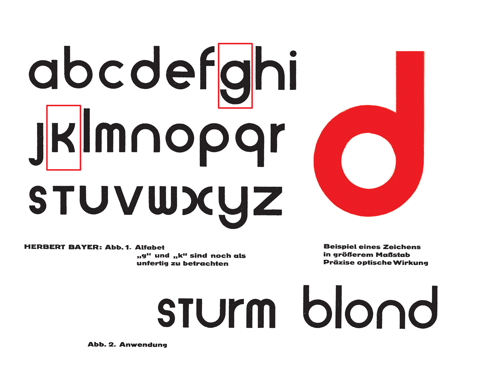
Jan Tschichold had written his milestone article largely upon impressions he got from visiting Bauhaus exhibition in Dessau where a lot of new typography grotesk typefaces were drawn on posters and any other things incorporating graphics. In the minds and hands of Bauhaus artists’ geometric forms of letters got cleaner and more thorough treatment, which peaked with ‘Universal’ by H.Bayer.
U8 specialist Brachmanna in book about underground stations of U8 mentions that indeed type selection was made according to models of ‘new typography’, construction is geometric and in sync with Bauhaus. We can imagine that U8 typeface was conceived quite by the ideals of J.Tscichold. Also, the question of authorship remains mysterious so far: my request to the archives7 of Berlin has not received any better answer than “possibly it was made by some draftsman / engineer”.
a) C.Brachmann, Licht und Farbe in Berliner Untergrund U-Bahnhöfe der Klassischen Moderne. Berlin, Mann, 2003
7 Landesarchiv Berlin, BVG Archiv, S-bahn Archive. Most architectural drafts are simply signed by chief architect Alfred Grenander.
Why big traffic makes typefaces to become grotesks?
During the construction of Berlin subway the ideas for details were possibly influenced not only by modernist cultural context. So how was the typeface style selected?
The first subway in the world – London Tube – could have given hints for new direction. Since 1916 a special typeface appeared on station signs (London Tube system got merged). That typeface marked a milestone for subway signage. It is hard to define to which extent Berlin subway graphic outlook got influenced by this. From pro and contra arguments we have to keep in mind that at the beginning of 20th century Germany had still its own very strong blackletter tradition. So next to Keiser style, (roman/antiqua) it would be thinkable to paint Fraktur or Schwabacher on the walls of U8. Still the choice was made in favour of grotesk. Typography research by C. Burked have shown that German type designer P. Renner (in mid-1920s) lived and created from Germany’s own tradition, and he knew about London underground typeface through words of other colleagues. It is hard to define graphical influences and trace the traffic of knowledge in the field back at that time. At least it is documented that technical know-how for subway was actually borrowed from Budapest11. Maybe pragmatical engineers found that under a certain angle and in weak lightning conditions grotesk poses less optical problems and it is easier to paint plates.
d) C.Burke, Paul Renner the art of typography, Hyphen press, London, 1998, p.94
11 Budapest – first subway built in continental Europe, 1896
Outro
I have enjoyed researching the dusty and damaged part of history12. It is nice to be every now and then the member of SBT9. Since my studies in the field of art and design, I have got an overview of the work completed by Bauhaus innovators. This has provided a superior concept for further development of typedesign, but which in its own time lead to none of working typefaces. The clash of geometric planars with the real world: the drawings drafted with a compass and a ruler needed to be transferred on the surface by painters with brushes. Example of U8 shows one of the links how Bauhaus designers probably borrowed from things seen around in Germany and vice versa.
12 30 years 40% of line had “ghost stops”- the train passed under Soviet Berlin without stopping. Heinrich-Heine-Straße, Jannowitzbrücke, Alexanderplatz, Weinmeisterstraße, Rosenthaler Platz, Bernauer Straße
9 SBT or Stoffbeutelträger – trainspotter.
In order to find material for this project I have filtered through subway related material… with no expectations. In the end I found much more than I expected to find and not only about flat wall panels.
Further Literature
- H.Knobloch, M.Richter, T, Wenzel, Geister Bahnhöfe, Ch. Links verlag, 1992
- Die Bahnhöfe der Berliner Hoch- und Untergrundbahn, Bongiorno, Biagia
- berliner-unterwelten.de (underground tours)
- de.wikipedia.org/wiki/U-Bahn
- Buchstaben museum: Leipziger Straße 49, 10117, Berlin
- untergrundbahn.de